More data on the way, preparing for “Decision-Easy Data Visualization”
*Get your crypto project/offer published on this blog and news sites. Email:contact@cryptoexponentials.com
“Seeing is believing.”; “A chart worth thousand numbers/words.”
I was thinking on the striking relevance of data visualization in today’s sphere of Big Data and Hyper-Connected world. As oceans of data available and zetta bytes of data coming in (44 zettabytes by 2020 i.e. 6 to 7 stacks from Earth to Moon), data scientists and analytics engines are doing more than satisfactory job in handling Volume, Velocity, Veracity and Variety of big data. While leapfrog advancement in analytics driving predictability and prescriptive insights, human touch is inevitable in making decisions. So coming up with decision-easy data visualization is critical.
To get insights into action, humans have to view, interpret and validate insights to get into actions. Hence data visualization plays a significantly important role in enabling decision-easy representation of insights. In view of visuals and graphics that are processed 60,000 times faster by the brain than other means of data, here are few anecdotes (deviating purposefully from business context for ease of reading) that substantiate importance of data visualization.

- Data visual on what the average American is doing with their time at any hour of the day, then question why so many people are still in bed at 8 a.m?
- Bloomberg’s interactive index for ranking of the world’s richest people, which is a dynamic measure of the world’s wealthiest based on market changes
- Showing how the number of disease cases have plummeted as a result of widespread vaccine usage
- Seeing on US map how perceptions are changed on gay marriage. Is it really like as the country goes, so goes the Supreme Court?
A clear understanding of what any data set is representing is key to visualization. More the data more the dimensions to handle. Data is no longer just a numeric. Recent patterns of big data constitute text messages, pictures, videos, virtual copies that represent physical world – factory layouts, processes and supply chains, voice etc. Channeling any type of data and pattern to a visual is a scientific process intermingled with intellectual horsepower.
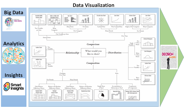
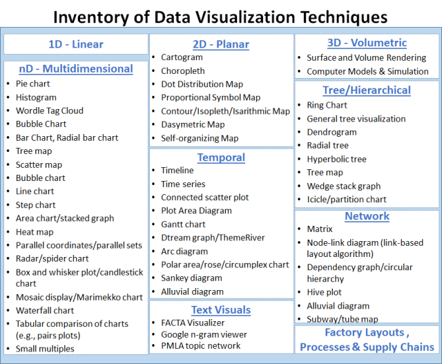
The success of visualization is a direct measure of how fast the viewer connect with visual and move on to next step in decision making in non-ambiguous manner, which is what I am calling as “Decision-Easy” frame of mind. Choosing the right type of visualisation depends on what needs to be shown (comparison, distribution, composition, or relationship), how much detail the viewer needs, and what information the viewer needs in order to be successful. With this context, I have provided details with the help of the diagram above on depth and breadth of data visualization techniques and their applicability in real life scenarios. Leveraged Dr. Andrew Abela chart chooser.

Shown above is the summary of most of the available data visualisation techniques. Although the variety of data visualisation options may feel overwhelming, choosing a right representation that clearly comprehend data and insights will be a game changer. Data offers significant buisness value and visualizing that data to enable decisions offers substantial value.
Recommended Reading
Storytelling with Data: A Data Visualization Guide for Business Professionals
Don’t simply show your data—tell a story with it!
Storytelling with Data teaches you the fundamentals of data visualization and how to communicate effectively with data. You’ll discover the power of storytelling and the way to make data a pivotal point in your story. The lessons in this illuminative text are grounded in theory, but made accessible through numerous real-world examples—ready for immediate application to your next graph or presentation.


